


New Montana State Library “Logo” Stirs up Controversy
The logo, designed by the Milwaukee-based firm Hoffman York, was unveiled to the library’s commissioners at a June 15 meeting

Commissioners of the Montana State Library, which manages a variety of state records and information systems, are considering scuttling a nearly $300,000 rebranding project because of what they regard as the new logo’s visual proximity to the LGBTQ Pride flag.
The logo, designed by the Milwaukee-based firm Hoffman York, was unveiled to the library’s commissioners at a June 15 meeting after receiving a positive reception from library staff in early May, according to the Montana Free Press. The presentation to the commission devolved into a critique and debate over a rainbow-esque part of the image.
“That is going to represent, from now on, what people see for us,” said Commissioner Tammy Hall, speaking at her first meeting after being appointed in March by Gov. Greg Gianforte. “I think a rainbow as to what we’re doing in the library is going to set off a firestorm.”
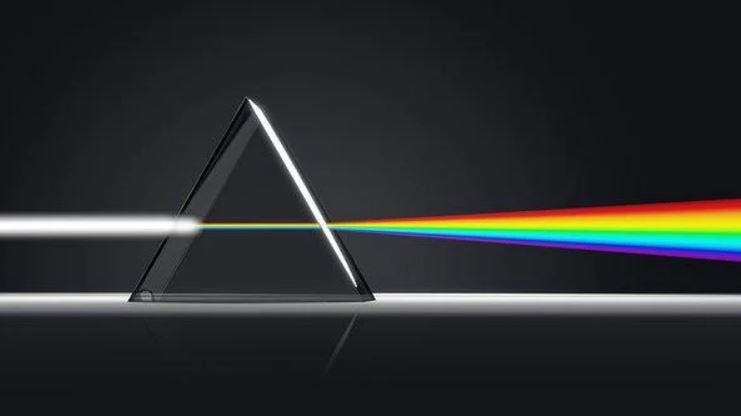
Addie Palin, representing Hoffman York, told the commissioners the multicolor portion of the logo was inspired by a prism, an object that disperses a beam of light into its component colors. Over the course of a nearly year-long design process that solicited feedback from library staff and commissioners, Palin said, the prism was one of the images that gained the most traction.
“People really liked it for the way that it provided clarity,” she told the commissioners. “How the prism, like the library, is a vehicle for distributing information in a new and different way.”
You can read the full story here. By: Mara Silver – Montana Free Press